Page Templates
Legrand categorizes pages depending on their settings and templates. These page templates are:
- Default - This is the default template. The layout of a default page includes a pre-hero section, followed by hero sectio, page content and a bottom navigation panel.
- Blog - A page containing all blog posts. Apart from the page options, additional settings about this template can be found in Theme Options » Blog Options
- Contact - A page containing map address and company information. Apart from the page options concerning this template, additional settings about this template can be found in Theme Options » Map Options
- Gallery Fullscreen Slider - This page displays all or a certain category of portfolio items in a fullscreen slider without any other content. The 'Gallery' menu is also displayed in this template.
- Gallery Contain Slider – This page displays all or a certain category of portfolio items in a variable slider which detects portrait or lansdcape modes. The 'Gallery' menu is also displayed in this template.
- Gallery Thumbnail Scroller – This page displays all or a certain category of portfolio items in a scrolling slider without any other content. The 'Gallery' menu is also displayed in this template.
- Gallery Justified Grid – This page displays all or a certain category of portfolio items in a grid without any other content. The 'Gallery' menu is also displayed in this template.
Page Options
Page options are divided in three main groups: options concerning all page templates, only Gallery templates or only Contact template
General Options
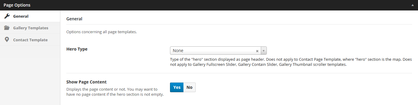
- Hero type – A hero is the header section of the page displaying a media (image, video or a slider). For Hero settings please refer to Hero Section.
Use 'None' for no hero header. Does not apply to Contact Page Template, where "hero" section is the map, therefore configurable in Contact Template options (see below). Does not apply to Gallery Fullscreen Slider, Gallery Contain Slider, Gallery Thumbnail scroller templates. - Show Page Content – Displays the page content or not. You may want to have no page content if the hero section is not empty (display only a full screen section, for example).
Gallery Template(s) Options

- Show Items From – Shows portfolio items belonging only to a specific category or all. Type in the portfolio category slug in this field, leave empty for all.
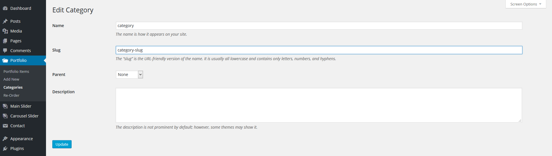
- You can retrieve the category's slug under Portfolio » Categories.
Contact Template Options
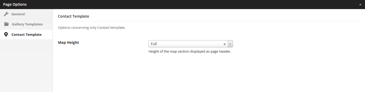
- Map Height – Half (will cover 50% of the screen), Full (will cover the whole screen).
Portfolio Post Options - Open in lightbox
Every portfolio item will be included in the gallery page as long as they have a featured image, so, ideally, each item will have a featured image. The featured image will be displayed as the gallery item thumbnail.
Project Type - Popup
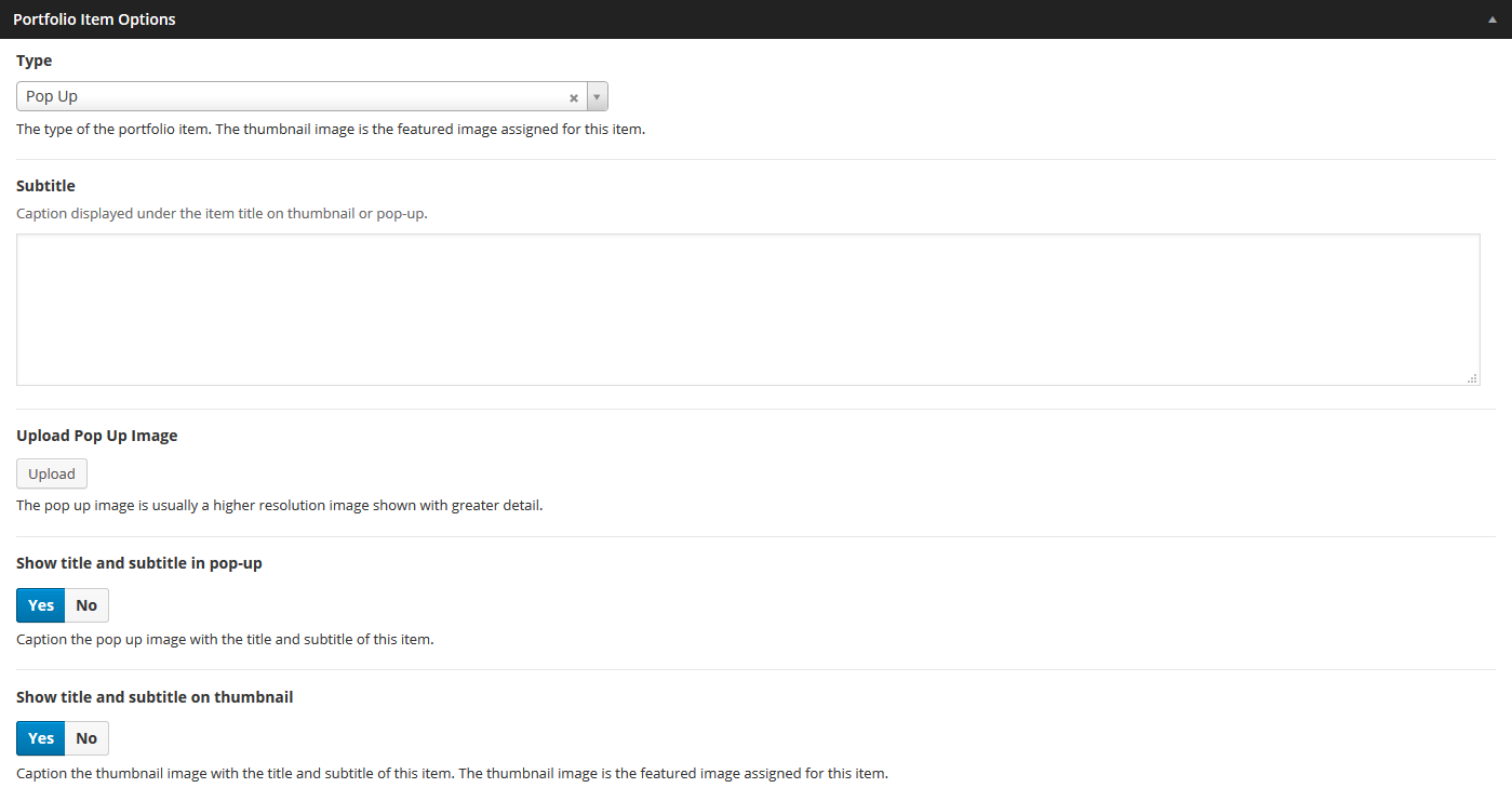
- Subtitle – Caption displayed under the item title on thumbnail or pop-up.
- Pop-up image – If the type is pop-up this is usually a higher res image of the thumbnail.
- Show title and subtitle in pop-up – Caption the pop up image with the title and subtitle of this item.
- Show title and subtitle in thumbnail – Caption the thumbnail image with the title and subtitle of this item. The thumbnail image is the featured image assigned for this item.
Project Type - External - Open in external page
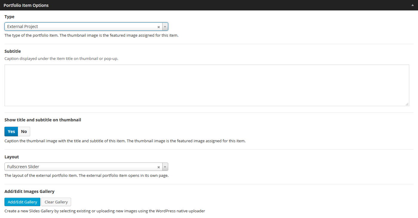
- External Project Layout – If the type is external, the layout of the external portfolio item.
- Gallery Fullscreen Slider – fullscreen slider without any other content
- Gallery Contain Slider – a variable slider which detects portrait or lansdcape modes
- Gallery Thumbnail Scroller – a scrolling slider without any other content
- Gallery Justified Grid – a grid without any other content
- Normal – a normal page with hero section.
- Hero type – if the external project layout type is Normal, a hero is the header section of the page displaying a media (image, video or a slider). For Hero settings please refer to Hero Section
Hero Section
A hero is the header section of a page (usually displayed after pre-hero) or portfolio item page displaying a media (image, video or a slider) and html content as overlaid content.
The hero content is captioned over the media, so you can add any overlaying html content using Hero Caption field.
There are four types of hero sections. if there is no hero section, the type is set to 'None' in the page options
Hero Type Image

Each hero image type has the following options:
- Hero Image – Specifies the background image of the hero section.
- Hero Image Overlay Color - an overlay color for hero image (default: #FFFFFF).
- Hero Image Overlay Color Opacity – Specifies the opacity of the overlay color.
- Hero Caption – Caption displayed over hero's image. HTML code allowed in this field.
- Caption Position
- Hero Height – Half (will cover 50% of the screen), Full (will cover the whole screen).
- Hero Position – Static (keeps same position through scrolling), Relative (scrolls with the page).
- Hero Content Type – Dark for darker content color or Light for lighter content.
Hero Type Video
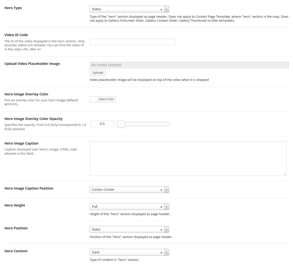
Each hero video type has the following options:
- Video ID – Specifies the background video ID of the hero section. Only youtube videos are allowed. You can find the video ID in the video URL after V= fragment. YTplayer is used, see YTPlayer Docs for more details.
- Video Placeholder Images – Video placeholder image will be displayed on mobile devices and when video is stopped.
- Hero Height – Half (will cover 50% of the screen), Full (will cover the whole screen).
- Hero Position – Static (keeps same position through scrolling), Relative (scrolls with the page).
- Hero Content Type – Dark for darker content color or Light for lighter content. The logo will change with this setting.
Hero Type Slider
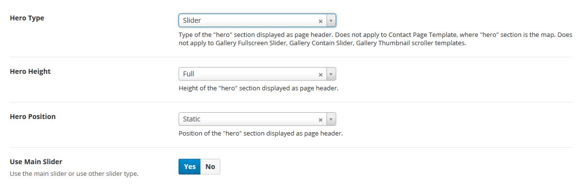
This hero type will display the Main Slider as defined in Main Slider section. The hero slider is not restricted only to Main Slider it can be of any type, such as Revolution Slider.
Each hero slider type has the following options:
- Hero Height – Half (will cover 50% of the screen), Full (will cover the whole screen).
- Hero Position – Static (keeps same position through scrolling), Relative (scrolls with the page).
- Use Main Slider – Use the Main Slider as hero section for this page or use another slider type. If another type, you will have to specify the shortcode for the custom slider.
- Your Slider Shortcode – Most of the popular slider plugins use shortcodes to insert sliders into content. Paste slider shortcode in this field.
For Portfolio Items the slider is an image gallery not the Main Slider.
Hero Type Carousel Slider
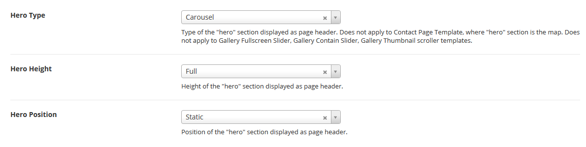
This hero type will display the Carousel Slider as defined in Carousel Slider section.
Each hero carousel slider type has the following options:
- Hero Height – Half (will cover 50% of the screen), Full (will cover the whole screen).
- Hero Position – Static (keeps same position through scrolling), Relative (scrolls with the page).
For Portfolio Items the carousel slider is not included as hero section.
Main Slider
Main slider is the slider displayed as the hero section of the page if the hero type option is set to Slider and Use Main Slider is set to Yes in page or portfolio item options. For Hero settings please refer to Hero Section.
Slides can be created as custom types using the admin sidebar menu and reordered using the post types order plugin or any other plugin facilitating custom types ordering.
The slide content is captioned over the slider's image, so you can add any html content overlaying the slide.
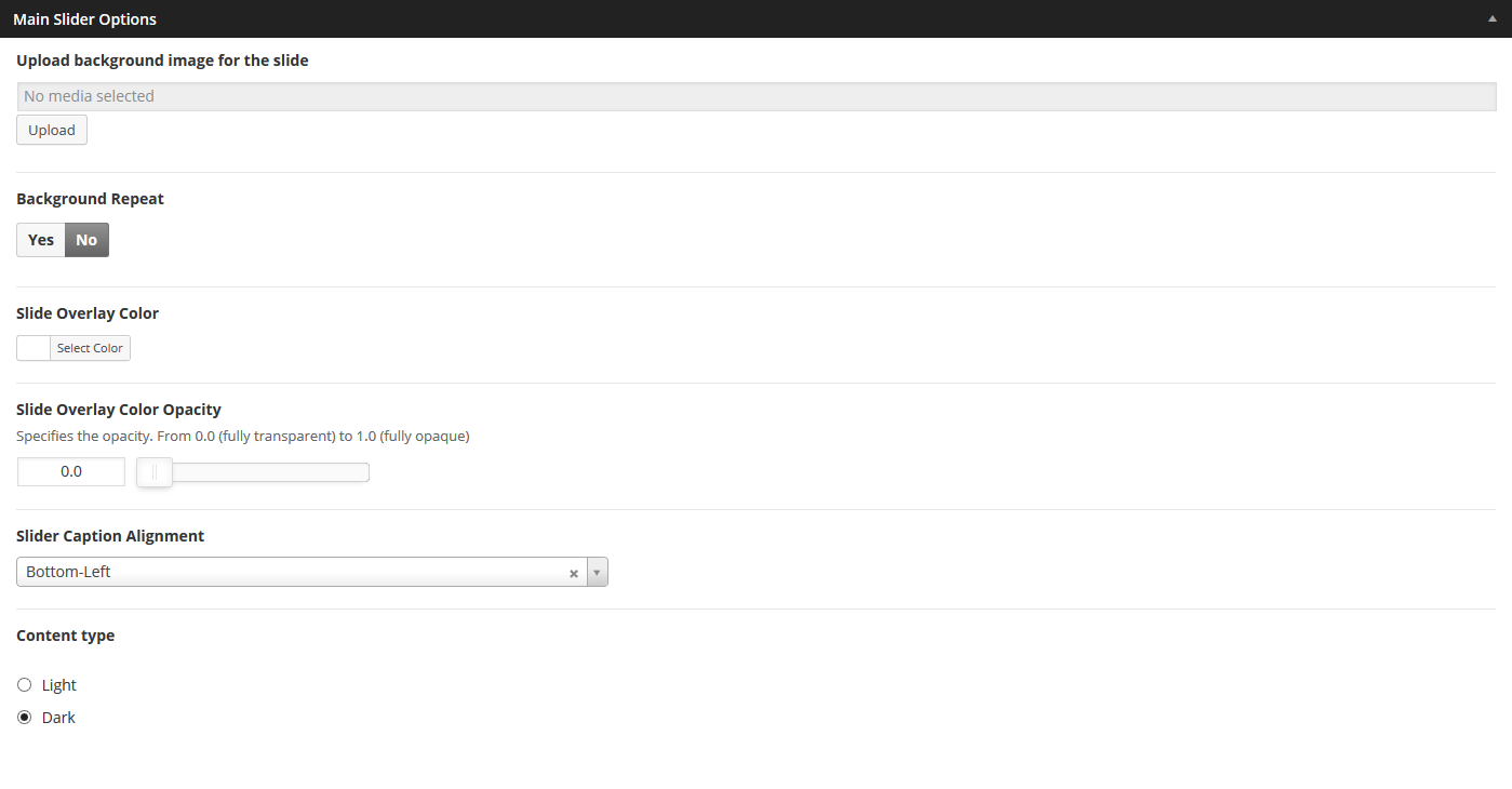
Each slide has the following options:
- Background Image – Specifies the header background image of the slide.
- Background Repeat – if the background image is a pattern set this to 'Yes'.
- Overlay Color
- Overlay Color Opacity – Specifies the opacity of the overlay color.
- Caption Alignment – Caption Alignment.
- Caption Content Type – Dark for darker content color or Light for lighter content. The logo will change with this setting.
Carousel Slider
Carousel slider is the slider displayed as the hero section of the page if the hero type option is set to Carousel in page or portfolio item options. For Hero settings please refer to Hero Section.
Slides can be created as custom types using the admin sidebar menu and reordered using the post types order plugin or any other plugin facilitating custom types ordering.
The slide content is captioned over the slider's image, so you can add any html content overlaying the slide.
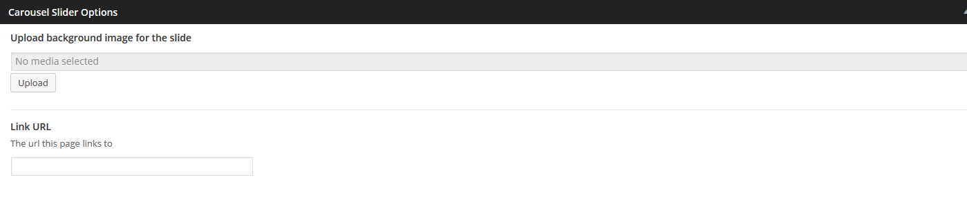
Each slide has the following options:
- Background image for the slide – Specifies the header background image of the slide.
- Link URL – an external page url this page links to.
Shortcodes
Legrand comes pre-packed with a number of shortcodes allowing you to add styled content to your site with little effort. Legrand is tightly integrated with Visual Composer editor, therefore you will see them when adding a new element.
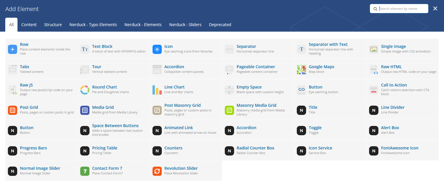
The shortcodes are grouped in several categories:
- Typo Elements – Title, Line Divider, Button, Space Between Buttons, Animated Link
- Elements – Accordion, Toggle, Alert Box, Progress Bars, Pricing Table, Counters, Radial Counters, Icon Service, Info Box, Lightbox Image Gallery
- Sliders - Normal Image Slider
If you choose not to install Visual Composer, conveniently, the available shortcodes have been included in a menu and shortcode editor. When creating a page or post, click the black L icon in the tinymce editor to reveal a list of shortcodes

WPML Compatible
Translating theme options
When translating theme options (WPML > String Translation), please translate the slider's text slides and not the parameters such as Slider Speed, Slider AutoPlay or Slider Transition Type.
The home slider will not recognize parameters translated in other languages.
Follow the WPML configuration file shipped with the theme to see which options are translatable and which are not. You can add or change the properties of the fields. The theme options can be found in /include/admin-config.php. The metabox options can be found in /include/metabox-config.php
Theme Translation
Legrand is fully localized and it has included the generated PO (Portable Object) in /languages folder. It contains all the translatable strings used by the theme.
Please visit the following links to learn more about translating WordPress themes: