Page Templates
Aruba categorizes pages depending on their settings and templates. These page templates are:
- Default - This is the default template. The layout of a default page includes a hero section followed by page content and the footer panel.
- Blog - A page containing all blog posts. Apart from the page options, additional settings about this template can be found in Theme Options » Blog Options
- Portfolio - This page displays all the Aruba portfolio items. Apart from the page options concerning this template, additional settings about this template can be found in Theme Options » Portfolio Options
- Portfolio Mixed - This page displays all the Aruba portfolio items, but it will display the page content underneath (or above) so that you can have a page with different set of sections.
You can limit also through page options how many portfolio items are being displayed.
Apart from the page options concerning this template, additional settings can be found in Theme Options » Portfolio Options - Contact Map - A page containing google map as hero section and usually contact information. The map address is specified in theme options. Apart from the page options concerning this template, additional settings about this template can be found in Theme Options » Map Options
Page Options
Page options are divided in two groups: all page templates (General) and Portfolio template(s)
General Options
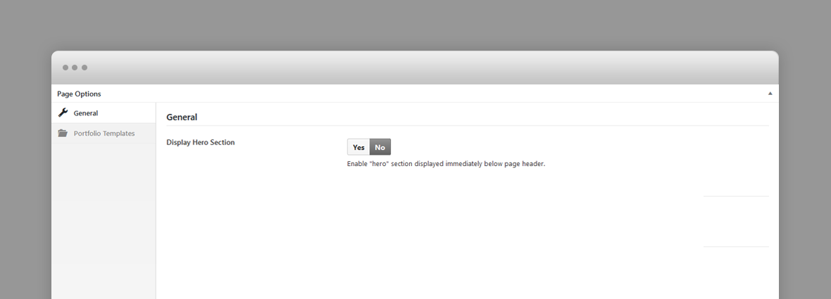
- Display Hero Section – A hero is the header section of the page displaying html content. For Hero settings please refer to Hero Section. Disable it for no hero header.
Portfolio Template(s) Options
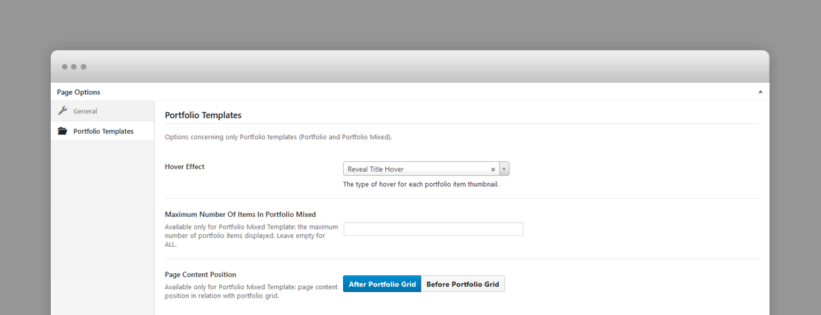
- Hover Effect – Type of hover effect over portfolio items thumbnails displayed in the portfolio page (Reveal Title, Big Hover, Floating Thumb Title, Title Overlay).
- Maximum Number Of Items In Portfolio Mixed – Available only for Portfolio Mixed Template: the maximum number of portfolio items displayed. Leave empty for ALL.
- Page Content Position – Available only for Portfolio Mixed Template: where the page content is being displayed: after or before the portfolio grid.
Portfolio Post Options
Every portfolio item will be included in the portfolio or showcase page templates as long as they have a featured image, so, ideally, each item will have a featured image. The featured image will be displayed as the portfolio item thumbnail.
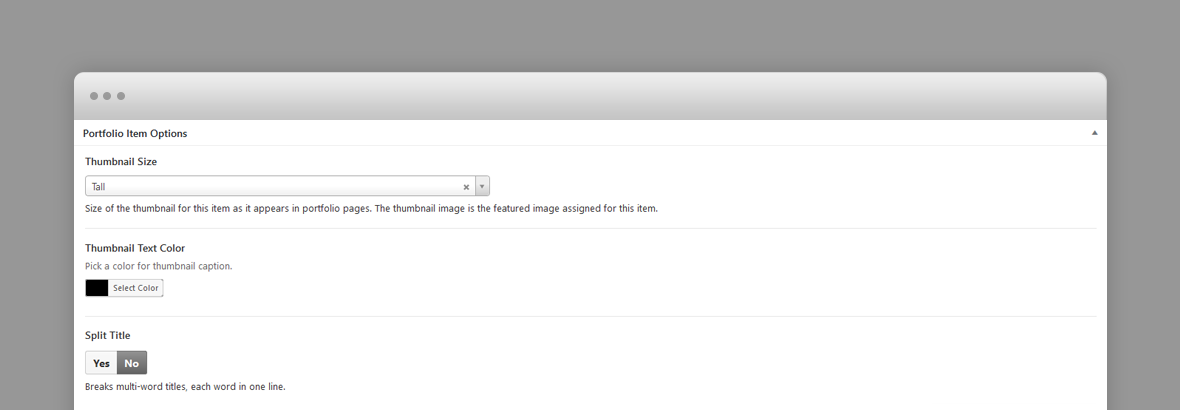
- Thumbnail Size – Size of the thumbnail for this item as it appears in portfolio pages (tall or wide). The thumbnail image is the featured image assigned for this item.
- Thumbnail Text Color – Specifies the color f this portfolio item thumbnail caption (title and categories). Default black (#000000).
- Split Title – Breaks multi-word titles, each word in one line.
- Display Hero Section – A hero is the header section of the page displaying html content. For Hero settings please refer to Hero Section. Disable it for no hero header.
Blog Post Options
The featured image of a post is displayed in the blog page as post thumbnail.
- Hero Image – Upload hero background image. Hero section is the header section displaying the post title and categories.
- Hero Image Foreground Type – The type of foreground in hero section, if there is a hero image.
Hero Section
A hero is the header section of a page, post or portfolio item page displaying html content.
You can add any overlaying html content using Hero Title and Subtitle fields. For a blog post the caption is the post title and its categories.
If there is no hero section, disable it in the page options.
Hero Options

Each hero section has the following options:
- Hero Caption Title – Caption title displayed over hero section.
- Hero Caption Subtitle – Caption subtitle displayed over hero section. HTML code allowed in this field.
- Hero Text Alignment – Hero caption text alignment (centered or left aligned).
- Hero Image – Hero background image displayed underneath the hero caption.
- Hero Position – fixed, scale or parallax.
- Scrolling Opacity
Predefined CSS classes used in our live demo and available in the theme
Several classes have been defined in order to properly aligned and display the WPBakery Page builder rows. You can specifiy them as Extra class name in row's options. They are as follow:
- row_padding_top – adds top padding space to the row.
- row_padding_bottom – adds bottom padding space to the row.
- small – small row width.
- full – makes the row full width.
- text-align-center – center aligns the text within the row.
- has-animation – adds an animation effect
Shortcodes
Aruba comes pre-packed with a number of shortcodes allowing you to add styled content to your site with little effort. Aruba is tightly integrated with WPBakery Page Builder editor, therefore you will see them when adding a new element.

The shortcodes are grouped in several categories:
- Typo Elements – Title, Button, Space Between Buttons
- Elements – Contact Info Box, Map, Image Collage, Popup Image, Video Hosted, Icon Service, Testimonials
- Sliders - Normal Image Slider, Carousel Image Slider
If you choose not to install WpBakery Page Builder, conveniently, the available shortcodes have been included in a menu and shortcode editor. When creating a page or post, click the black A icon in the tinymce editor to reveal a list of shortcodes

WPML Compatible
Translating theme options
Follow the WPML configuration file shipped with the theme to see which options are translatable and which are not. You can add or change the properties of the fields. The theme options can be found in /include/admin-config.php. The metabox options can be found in /include/metabox-config.php
Theme Translation
Aruba is fully localized and it has included the generated PO (Portable Object) in /languages folder. It contains all the translatable strings used by the theme.
Please visit the following links to learn more about translating WordPress themes: