Page Templates
Ernest categorizes pages depending on their settings and templates. These page templates are:
- Default - This is the default template. The layout of a default page includes a hero section with captions followed by page content and the footer panel.
- Blog - A page containing all blog posts. Apart from the page options, additional settings about this template can be found in Customizer » Blog Options
- Showcase Templates - These page templates display all the Ernest portfolio items using the WebGL slider, carousel or a vertical list with floating thumbnail on hover. The templates are as follows:
- Portfolio Showcase
- Portfolio Showcase Extended - extended portfolio type with scrollable content under the showcase webgl slider
- Portfolio Carousel
- Portfolio List
- Portfolio Grid - These page templates display Ernest portfolio items as creative masonry grid. Apart from the page options concerning this template, additional settings can be found in Customizer » Portfolio Settings.
Page Options
Page options are divided into three groups: all page templates (General), Portfolio template(s), Portfolio Grid and Portfolio List template(s)
General Options
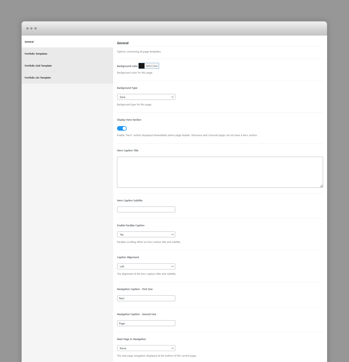
- Background Color – The background color of this page.
- Background Type – The background type of this page. Works in conjunction with background color. It can be White (with dark content) or Black (with light content). The logo version (light or dark) will be selected automatically depending on this setting.
- Display Hero Section – A hero is the header section of the page displaying html content. For Hero settings please refer to Hero Section.
- Next Page In Navigation – The next page navigation displayed at the bottom of the current page. Select None to disable the bottom page next navigation.
Portfolio Templates Options
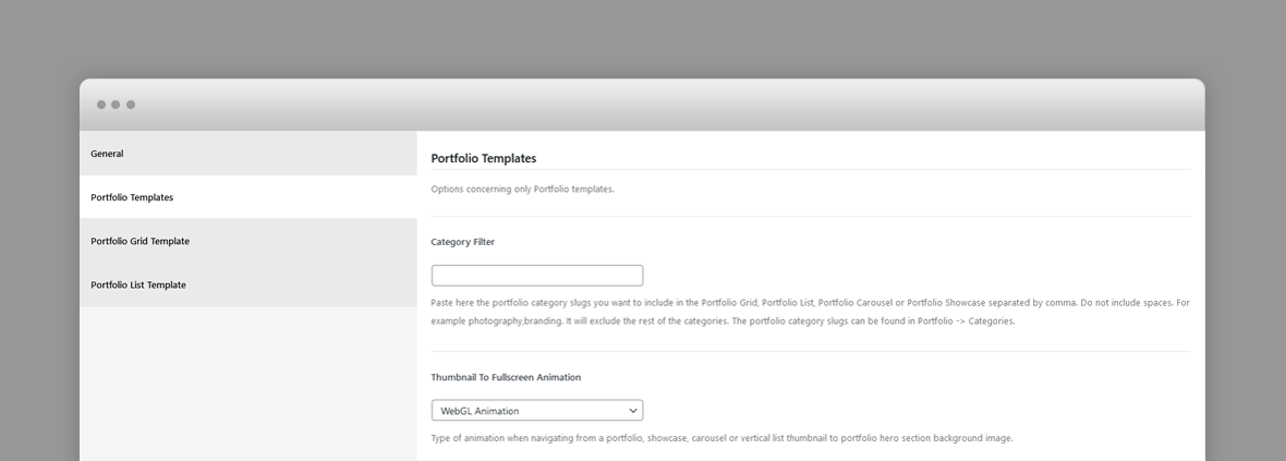
- Category Filter – Paste here the portfolio category slugs you want to include in the Portfolio templates, separated by comma. Do not include spaces. For example photography,branding. It will exclude the rest of the categories. The portfolio category slugs can be found in Portfolio -> Categories.
- Thumbnail To Fullscreen Animation – Type of animation when navigating from a portfolio, carousel or vertical list thumbnail to portfolio hero section background image.
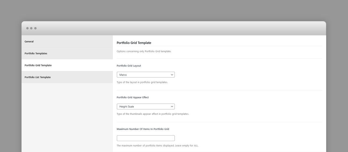
Portfolio Grid Template Options
- Category Filter – Paste here the portfolio category slugs you want to include in the Portfolio templates, separated by comma. Do not include spaces. For example photography,branding. It will exclude the rest of the categories. The portfolio category slugs can be found in Portfolio -> Categories.
- Portfolio Grid Layout – Type of the layout in portfolio grid templates.
- Portfolio Grid Appear Effect – Type of the thumbnails appear effect in portfolio grid templates.
- Maximum Number Of Items In Portfolio Grid – The maximum number of portfolio items displayed. Leave empty for ALL.
Portfolio List Template Options
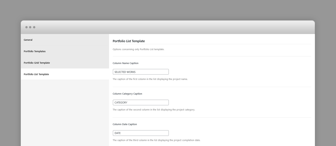
- Column Name Caption – The caption of the first column in the list displaying the project name.
- Column Category Caption – The caption of the second column in the list displaying the project category.
- Column Date Caption – The caption of the third column in the list displaying the project completion date.
Portfolio Post Options
Every portfolio item will be included in the Showcase or Portfolio page templates as long as they have a Hero image, so, ideally, each item will have a Hero image. The hero image will be displayed as the showcase slide and at the top of the individual project page.
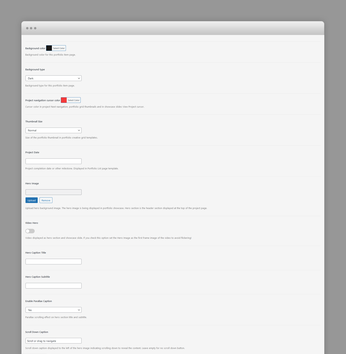
- Background Color – The background color of this page.
- Background Type – The background type of this page. Works in conjunction with background color. It can be White (with dark content) or Black (with light content). The logo version (light or dark) will be selected automatically depending on this setting.
- Project Navigation Cursor Color – Cursor color in project Next navigation, portfolio grid thumbnails and in showcase slides View Project cursor.
- Thumbnail Size – Size of the portfolio thumbnail in portfolio creative grid templates.
- Project Date – Project completion date or other milestone. Displayed in Portfolio List page template.
- Hero Image – Upload hero background image. The hero image is being displayed in portfolio showcase. Hero section is the header section displayed at the top of the project page.
- Video Hero – Video displayed as hero section and showcase slide. If you check this option set the Hero Image as the first frame image of the video to avoid flickering!
- Webm Video Url – URL of the showcase slide background webm video. Webm format is previewed in Chrome and Firefox.
- Mp4 Video Url – URL of the showcase slide background MP4 video. MP4 format is previewed in IE, Safari and other browsers.
- Hero Caption Title – Caption title displayed over hero section. The hero background image is set in the hero image set in preceding option.
- Hero Caption Subtitle – Caption subtitle displayed over hero section. Enter plain text.
- Enable Parallax Caption – Parallax scrolling effect on hero section title and subtitle.
- Scroll Down Caption – Scroll down caption displayed to the left of the hero image indicating scrolling down to reveal the content. Leave empty for no scroll down button.
Blog Post Options
The featured image of a post is displayed in the blog page as post thumbnail.
- Background Color – The background color of this page.
- Background Type – The background type of this page. Works in conjunction with background color. It can be White (with dark content) or Black (with light content). The logo version (light or dark) will be selected automatically depending on this setting.
- Header Caption Alignment – The alignment of the blog post caption.
Hero Section
A hero is the header section of a page, post or portfolio item page displaying html content and for portfolio items, a background image.
You can add any overlaying html content using Hero Title and Subtitle fields. For a blog post the caption is the post title and its categories.
If there is no hero section, disable it in the page options for default templates.
Hero Options
The hero section options varies depending on the post type (page, blog post or portfolio item) however each hero section can have the following options:
- Hero Caption Title – Caption title displayed over hero section.
- Hero Caption Subtitle – Caption subtitle displayed over hero section. HTML code allowed in this field.
For portfolio items you can define video hero section, in which case the corresponding showcase slide will display the video as well:
- Video Hero – Video displayed as hero section and showcase slide. If you check this option set the Hero Image as the first frame image of the video to avoid flickering!
- Webm Video Url – URL of the showcase slide background webm video. Webm format is previewed in Chrome and Firefox.
- Mp4 Video Url – URL of the showcase slide background MP4 video. MP4 format is previewed in IE, Safari and other browsers.
Predefined CSS classes used in our live demo and available in the theme
Several classes have been defined in order to properly align and display Ernest Gutenberg blocks and WPBakery Page builder rows. You can specify them as Additional CSS Class in Gutenberg or Extra class name in row's options in WPBakery. They are as follow:
- row_padding_all – padding space on all sides (8vw).
- row_padding_top – top padding space to the row (8vw).
- row_padding_bottom – bottom padding space to the row (8vw).
- row_padding_left – left padding space to the row (8vw).
- row_padding_right – right padding space to the row (8vw).
- light-section – when added to a clapat gutenberg container as extra class name will define a light background section within the page, regardless the overall page background color.
- dark-section – when added to a clapat gutenberg container as extra class name will define a dark background section within the page, regardless the overall page background color.
- small – small row width.
- full – makes the row full width.
- text-align-center – center aligns the text within the row.
- has-animation – adds an animation effect
- has-mask – Use only for Headings for letters fade in effect
- has-parallax – adds a parallax effect to all the images inheriting this class.
- one_half – First 1/2 Column
- one_half last – Last 1/2 Column
- one_third – 1/3 Columns
- two_third last – 2/3 Column
Note to the WPBakery users: WPBakery row's properties and some of the elements are not compatible with AJAX loading. You can install the child theme in the main archive that provides compatibility between AJAX page transitions and basic WPBakery elements (rows, columns and their properties) It is recommended to use our shortcodes, predefined classes or create your own CSS classes in appearance -> customizer -> additional CSS and add them to Extra class name attribute of the current row. This works great with AJAX loading. More workarounds for WPBakery and loading pages with AJAX: Here
Shortcodes
Ernest comes pre-packed with a number of shortcodes allowing you to add styled content to your site with little effort. Ernest is tightly integrated with Gutenberg editor, therefore you will see them when adding a new block. Ernest blocks appear under Ernest Blocks section
If you are using Elementor as your editor, you are able to use Ernest's shortcodes in the form of Elementor widgets:

Ernest is also tightly integrated with WPBakery Page Builder editor, therefore you will see them when adding a new element.

The shortcodes are grouped in several categories:
- Typo Elements – Title, Button, Space Between Buttons, Text Link
- Elements – Accordion, Contact Info Box, Map, Image Collage, Popup Image, Video Hosted, Icon Service, Clients, Marquee Content
- Sliders - Normal Image Slider, Carousel Image Slider
If you choose not to use Gutenberg, Elementor or WpBakery Page Builder and you install Classic Editor plugin, conveniently, the available shortcodes have been included in a menu and shortcode editor. When creating a page or post, click the black N icon in the tinymce editor to access a list of shortcodes

WPML Configuration File
Translating theme options
Follow the WPML configuration file shipped with the theme to see which options are translatable and which are not. You can add or change the properties of the fields. The theme options can be found in /include/admin-config.php. The metabox options can be found in /include/metabox-config.php
Theme Translation
Ernest is fully localized and it has included the generated PO (Portable Object) in /languages folder. It contains translatable strings used by the theme.
Please visit the following links to learn more about translating WordPress themes: